Wednesday, April 29, 2009

Week 14- Part Dos


NEW WEBSITE- CLICK HERE

Monday, April 27, 2009

Week 13

Assignment: Send out magazine for publication. Final.

Craft: Use my account on Lulu.com to upload my spreads and cover. After publishing the magazine I had to buy it. I am hoping to see that I worked out all of the design and craft problems before I sent it out for the final publication. I should receive the magazine by this coming Friday. If  it turns out how I wanted it to I will order another copy for my portfolio. 
Composition: I had a few minor mistakes to fix. It was not a very long editing process, but I am confident that I got all of the problems worked out. I chose the colors that I did because they work well with the first few pages of the magazine and I think they look sharp. I chose the title of the magazine to be Omniscient Palm because it ties in the cover art work and it goes well with the abstract feel of some of the art. 
Concept: I wanted to have the best final product that I could have. I guess only time will tell.... *Nervous*

Wednesday, April 15, 2009

Week 12

Assignment: To create a website for our magazine.
Craft: Using iWeb I created a web site containing three pages, a welcome page, about the editor page, and a slide show page. I chose a template to follow to create mt page. On the welcome page I included a picture of the cover and a link to the other computer graphics magazines. On the about the editor I included a picture of myself and various information about myself. On the slideshow page I included pictures of the content of the magazine in which people have the option of viewing them as a slide show.
Composition: I chose the template I did because it was different than any websites I have ever seen. I wanted my site to stand out and be as unique as the magazine is.
Concept: The concept was to create a website that is eye catching, simple to use, and functional. I feel I have achieved this goal.

Wednesday, April 8, 2009

Week 12


Assignment: Send out magazine for publication. Proof.

Craft: Create an account on Lulu.com and upload my spreads and cover. After publishing the magazine I had to buy it.  When I receive this magazine I will proof read it and make any corrections necessary. I will then send redo the initial step and upload my spreads with the corrections and order the final magazine. 
Composition: I created a cover for my magazine before sending it out. I decided to use a drawing from my sketch book on top of a gradient. I chose the colors that I did because they work well with the first few pages of the magazine and I think they look sharp. I chose the title of the magazine to be Omniscient Palm because it ties in the cover art work and it goes well with the abstract feel of some of the art. 
Concept: I wanted to create a complete magazine for my proof so that I have a better foundation for my final magazine.

Sunday, March 29, 2009

Week 8


Assignment- Create two 2-page magazine spreads.


Craft (process)How did you do it?Using Adobe In Design I was able to create ten different spreads. I used other students work and their compiled blogs to create two page spreads. The black pointer tool, free transformation tool, white pointer tool, and the frame tool were key in my construction of the spreads.


Composition : There are many different compositions in this layout of the magazine. Certain pieces of art look better in certain formats. My job was to create formats that fit the pieces of art. For instance, the zombie Abe Lincoln looks best next to a black text page.


Concept: The concept was to create a magazine of art work that was easy to read, but still had its own unique style.


How can I improve it? Make my text smaller, use more pull quotes, and be more consistent.

Week 11


Assignment- Create another 10 2-page magazine spreads.
Craft (process)How did you do it?Using Adobe In Design I was able to create ten different spreads. I used other students work and their compiled blogs to create two page spreads. The black pointer tool, free transformation tool, white pointer tool, and the frame tool were key in my construction of the spreads. After creating ten last week I had to go back to each of them and replace the illustrator files with jpegs. I also had to export my spreads so I can print them out for class.
Composition : There are many different compositions in this layout of the magazine. Certain pieces of art look better in certain formats. My job was to create formats that fit the pieces of art. For instance, the zombie Abe Lincoln looks best next to a black text page.
Concept: The concept was to create a magazine of art work that was easy to read, but still had its own unique style. I think I am well on my way to achieving that.How can I improve it? Never use the computers by the rawing room to edit my in design or illustrator files ever again because they caused me to lose five of the first ten I had done. Because of that I had to create fifteen this past week.

Week 10

Assignment- Create 10 2-page magazine spreads.
Craft (process)How did you do it?Using Adobe In Design I was able to create ten different spreads. I used other students work and their compiled blogs to create two page spreads. The black pointer tool, free transformation tool, white pointer tool, and the frame tool were key in my construction of the spreads.
Composition : There are many different compositions in this layout of the magazine. Certain pieces of art look better in certain formats. My job was to create formats that fit the pieces of art. For instance, the zombie Abe Lincoln looks best next to a black text page.
Concept: The concept was to create a magazine of art work that was easy to read, but still had its own unique style. I think I am well on my way to achieving that.
How can I improve it? Make my text smaller, use more pull quotes, and be more consistent.

Week 9

Assignment- Convey a message via Digital Illustration using Text and Images (Image could not be uploaded due to technical difficulties)
Craft (process): How did you do it?I have used the pencil tool as my primary illustration tool. Using the Type tool and various colors of fonts I created people in the pews and created a priest in front of the congregation. I also created a cross at the front of the church made from the a text version of the things people in the "church" should believe in or what they say they believe in.

Composition: Why this photo? I chose to create this image to reveal hypocrisy in the church.
Why the colors?I chose these colors for a more realistic feel. I chose the black for the people to make them stand out. I also chose the different colors of text because each sin is different in its own way and I didn't want it to seem uniform.
Concept: I created this image as I mentioned before to point out hypocrisy in the church. Hypocrisy in the church is something I have witnessed first hand and it is truly one of my biggest pet peeves.

Wednesday, February 18, 2009

Week 5

Chicago Art Dept. February 13, 2009- 200 Lincolns Opening


Assignment- Digital Illustration using Text (picture not available)

Craft (process)How did you do it?
Using the Type tool and various colors of fonts I was able to create a simple illustration as practice for the next, more intricit, project using text.

Composition
Why this photo? I chose to create this image because we were asked to create a simple illustration.

Why the colors?
I chose these colors for a more realistic feel, even though the picture itself is not very realistic. Concept
I created this image to get a feel for the tools that I will have to use in the next project.

Tuesday, February 10, 2009

Week 4


Assignment- Digital Illustration of Abraham Lincoln
The Great(s)?

Craft (process)
How did you do it?
I took my previous Lincoln/Obama illustration and bumped the opacity of Lincoln down so that it is as if he is a ghost-like figure or memory. I also moved Licoln to where he is above Obama, so it looks like Obama is looking up at or thinking about Lincoln.
How can you improve it? I can go in and touch up on some of my craft problems. There is a piece on Lincoln's neck where the flag shows through, so I will go in and cover that.

Composition
Lincoln/Obama
Why this photo? I chose the Lincoln photo because he is looking directly at the viewer and that helps bring your focus to him. This is what I wanted because this project is about him. I chose the Obama because he seems to be looking up, which makes it seem like he is looking up at something (Lincoln).
Why the colors? 
I chose the colors I did for the Lincoln/Obama because I wanted a more realistic feel. 
Why did you fill the page the way you did?  I chose this composition because, as mentioned before I wanted it to seem as if Obama was looking up at Lincoln possibly aspiring to be one of the greats.

Concept
I see potential in Obama to become one of the greats as Lincoln was. The composition conveys the message that Obama is aspiring to be one of the greats as well. 

Wednesday, February 4, 2009

Week 3


Assignment- 3 Digital Illustrations of Abraham Lincoln

Craft (process)
How did you do it? Using the pencil tool on Adobe Illustrator I was able create shapes with a solid fill that represent different features of Lincoln and Obama's portrait. By overlapping and using color variation of the shapes I was able to create depth in features such as the wrinkle, nose, and eyes. I also used the paint brush tool to create a background on the Obama/Lincoln piece that sets it apart from the foreground. Gradients helped me bring depth to the eyes on each portrait as well.  
How can you improve it? I plan to use the direct selection tool to tweak my craft problems. For the Lincoln/Obama I will place Lincoln higher in comparison to Obama. 

Composition
Lincoln/Obama
Why this photo? I chose the Lincoln photo because he is looking directly at the viewer and that helps bring your focus to him. This is what I wanted because this project is about him. I chose the Obama because he seems to be looking up, which makes it seem like he is looking up at something (which will be the picture of Lincoln I have placed above him).
Why the colors? I chose the colors I did for the blue lincoln(not pictured due to technical difficulties) because I had "The Old Guitarist" in mind. I chose the colors I did for the Lincoln/Obama because I wanted a more realistic feel. As for the black and white abe, I chose to pull the saturation up a little more in the flag background to make it stand out. 
Why did you fill the page the way you did? For the black and white Lincoln the actual version of my work is cropped to where it does not include the bow tie and a majority of the shirt and jacket. I chose to crop the picture in this way so the work was a tight shot of his face since I was aiming to focus on the defining features of Lincoln's very distinct face. For the blue Lincoln I wanted to zoom out a bit to encompass more of his upper body. I chose the composition for the Lincoln/Obama because, as mentioned before I wanted it to seem as if Obama was looking up at Lincoln possibly aspiring to be one of the greats.

Concept
In my last blog I spoke of how I wanted to place Lincoln at the Presidential inauguration of Obama. I feel I have accomplished this, if not in a direct, in an abstract way. 

Wednesday, January 28, 2009

Week 2

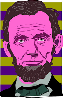
Assignment- Digital Illustration of Abraham Lincoln

Craft (process)
How did you do it? Using the pencil tool on Adobe Illustrator I was able create shapes with a solid fill that represent different features of Lincoln's portrait. By overlapping and using color variation of the shapes I was able to create depth in features such as the wrinkle, nose, and eyes.
How can you improve it? I plan to use different fill techniques like gradients to increase depth. I also plan to use different brush strokes so there are strokes unique to the skin and strokes unique to the beard and hair. I will look into a different color scheme.

Composition
Why this photo? I chose this photo because I wanted to focus primarily on Lincoln's face and this photo was large enough to do so.
Why the colors? I choose the different warm reds/pinks and browns to bring Lincoln forward against the background of the cooler purple and green.
Why did you fill the page the way you did? The actual version of my work is cropped to where it does not include the bow tie and a majority of the shirt and jacket. I chose to crop the picture in this way so the work was a tight shot of his face since I was aiming to focus on the defining features of Lincoln's very distinct face.

Concept
Where or when should Lincoln be in this prtrait by next week? My initial thought was to include Lincoln in some way with the Obama inauguration, but I have yet to decide if I want to run with that idea.

Monday, January 12, 2009

Week 1


Assignment:
Set up Blog

Craft
supplies- A photo of myself, a computer, and the internet.
Step one- set up gmail account.
Step two- Log into blogger.com
Step three- create blog

Compositon
Why this picture? Used to be my facebook default.
Why this template? easy on the eyes.

Concept
Who is your hero?
My Granny. She has been through more things than any number of people should have to go through and she is still feisty.
What makes you the happiest?
A combination of things make me happy. My sisters. Making art. My nephews and niece. Playing soccer. Missions...

Where did you come from?

I'm from West Virginia and Emily Street to Ohio and East Osborne,

I'm from sweat lodges and sacred lands,

From pow wows and tee pees.

I'm from the indian tribe to the congregation,

From "holy Grandfather" to "Precious Lord".

I'm from Ed Dyer to Bang Bang Orangotang

From donkey kicks to Jackie getting stuck in the bleachers.

I'm from Brent Bittenbender and Bash the Trash to Chris Wheeler and dodgeball.

I'm from Hanson to Bright Eyes,

From "Mmm Bop" to "Bowl of Oranges".

I'm from Coney Island and the Super Round Up,

From Jack to Patrick.

I'm from being the youngest of four with three crazy sisters,

From being an aunt of three with two nephews and a neice.

I'm from Splash parties to Café,

From Alan Weinel to Braiden the Canadian,

I'm from T.O.D to Z-games,

From homemade sleds to homemade costumes.

I'm from "write me a note" to "send me a text",

From "voteforfun.com" to "MySpace"

I'm from a medical doughnut to a wheelchair,

From "doughnut" to "Bionic Woman".

I'm from Nurse Dave to falling out of my wheelchair,

From Gary Donaworth to the midget refs.

I'm from "Mia Hamm" to "Ayam",

From "Swartzy" to "Mayalookingood".

I'm from Tyler Pace streaking to Mitch Pace "flying",

From Andrew Hoeter the comedian to Josh Baker and his booty roll.

I'm from the soccer field to the sketching pad,

From neon cleats to gum erasers.

I'm from the good times and the bad,

From the best to the worst.

I'm from the experiences I've had and the lives I've touched,

From the mistakes I've made to the people who have touched me.

I'm from the only thing that ever mattered being the only thing that didn't count.

I'm from the place I call home to the place I want to be,

From the memories to the future.

I'm from what some call the beginning to the unknown end.

I'm from October 12,1988 to only God knows when.

When did you last get blamed?

Right before I returned to school for various things that I had nothing to do with.

Why do you get out of bed in the morning?

I get out of bed in the morning in hopes that today will offer me something better than yesterday. A new day= a new journey.

How do you feel?

Today I feel amazing because Rabe's class got cancelled. :)