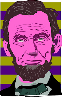
 Assignment- Digital Illustration of Abraham Lincoln
Craft (process)
How did you do it? Using the pencil tool on Adobe Illustrator I was able create shapes with a solid fill that represent different features of Lincoln's portrait. By overlapping and using color variation of the shapes I was able to create depth in features such as the wrinkle, nose, and eyes.
How can you improve it? I plan to use different fill techniques like gradients to increase depth. I also plan to use different brush strokes so there are strokes unique to the skin and strokes unique to the beard and hair. I will look into a different color scheme.
Composition
Why this photo? I chose this photo because I wanted to focus primarily on Lincoln's face and this photo was large enough to do so.
Why the colors? I choose the different warm reds/pinks and browns to bring Lincoln forward against the background of the cooler purple and green.
Why did you fill the page the way you did? The actual version of my work is cropped to where it does not include the bow tie and a majority of the shirt and jacket. I chose to crop the picture in this way so the work was a tight shot of his face since I was aiming to focus on the defining features of Lincoln's very distinct face.
Concept
Where or when should Lincoln be in this prtrait by next week? My initial thought was to include Lincoln in some way with the Obama inauguration, but I have yet to decide if I want to run with that idea.


No comments:
Post a Comment